Make a digital map with Carto
In addition to NYCommons, the mapping tools listed in Maps and Data Sources for Community Planning can help you learn a lot about the area you’re in. You can use these to generate customized maps to print out and use at workshops or for discussions. We’ve found that taking the extra time to generate an attractive map or other graphics helps people visualize problems and possible solutions more effectively.
If you want to dive deeper into mapping data on your own, online platforms like Carto allow you to upload datasets in map form for display and analysis—this can be a great tool if you want to dig into the wealth of publicly available data to better understand your neighborhood. Carto is a tool that allows users to build maps from scratch; some functions are limited to paid users, but a setting up a free account allows you to do quite a lot.
- Set up an account
Click here to sign up for an account with a 30 day free trial, which will allow you to build your own maps. To extend beyond 30 days and get a permanent free account email community@carto.com with the subject "Ambassador account for working on NYCommons" and cc psegal@urbanjustice.org.
- Import data
To make a map, you first need to bring data into your account–spatial data, specifically. When you bring spatial datasets into a map, they become “layers” and show up as shapes: these can represent districts such as council districts, boroughs, or census tracts; places like parks, schools, or NYCHA campuses; or anything else that can be found on a map.
Note: There are two ways to view spatial datasets: as a table or spatially (as shapes). Once you have a map, you can click on the name of a map layer and then view the underlying data by clicking the small blue icon in the lower left hand corner that looks like three columns.
This will display the dataset in table form–each shape in the dataset is a row and each field of information is a column. Similarly, the default view of a dataset when navigating to it from your account rather than through a map is in table form, but you can see it spatial form by selecting Preview.
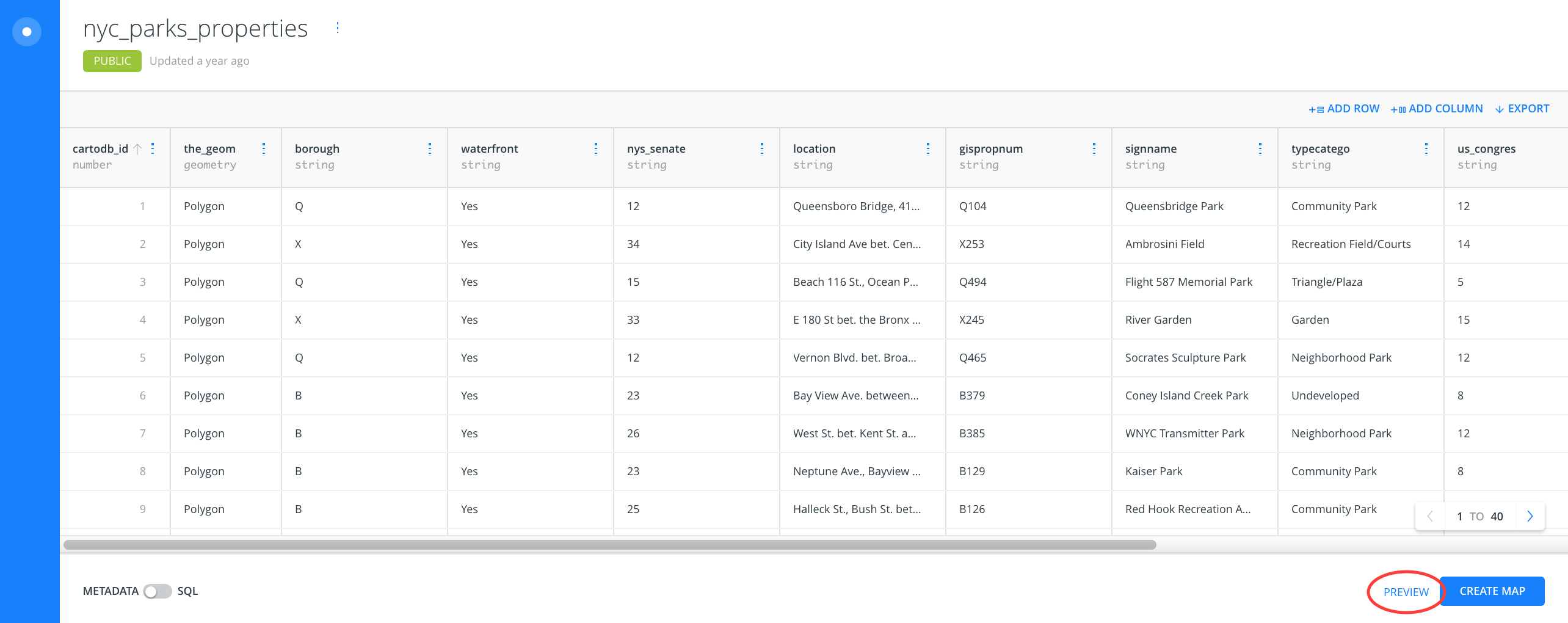
E.g. The dataset of NYC Parks Properties will display in a map as shapes that represent each property owned by the NYC Parks Department. The underlying data table will show each property as a row and the columns will contain the name of the property, the borough it’s in, a description of its location, and the type of property it is (some are actual parks, some aren’t), among other information.
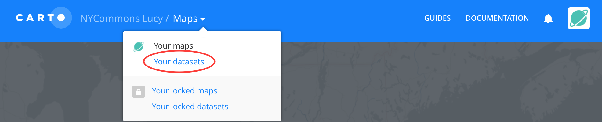
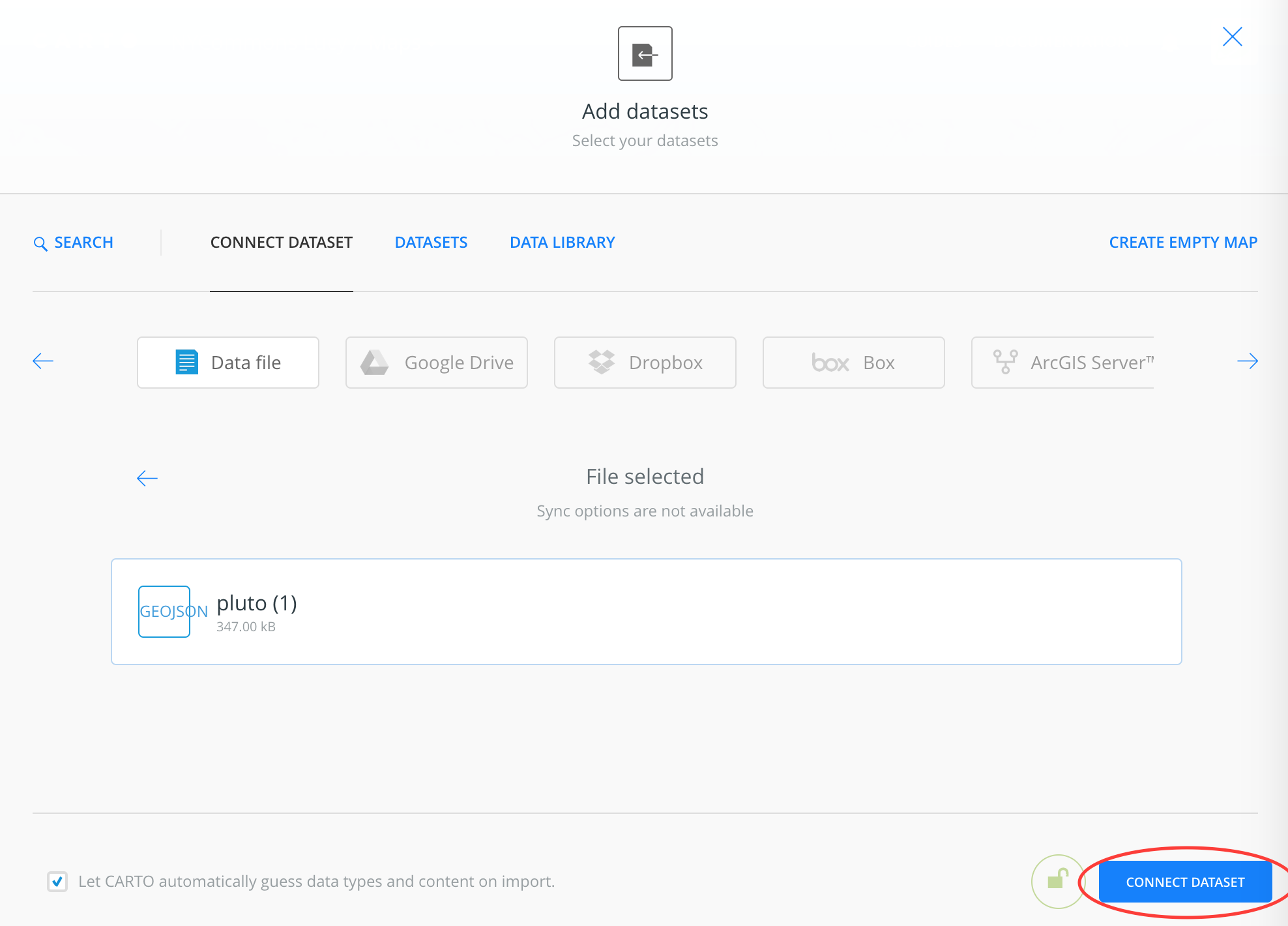
To bring new data into your Carto account, switch Maps to Datasets at the top of the page and click on New Dataset. Once you have a dataset file ready, click Connect Dataset to bring it into your account. You can also drag files directly onto the screen to connect them.
Using NYC OpenData
To start out, you can access a large amount of NYC-specific spatial data to use for mapping via New York City’s OpenData portal–these spatial datasets are like tables you might view in Excel, but each row has a geographic reference.
Below are example datasets available through NYC OpenData that you can download and then connect to your Carto map. To use these datasets as layers in your own map, first download them via the Export tab. The GeoJSON format works well for Carto.
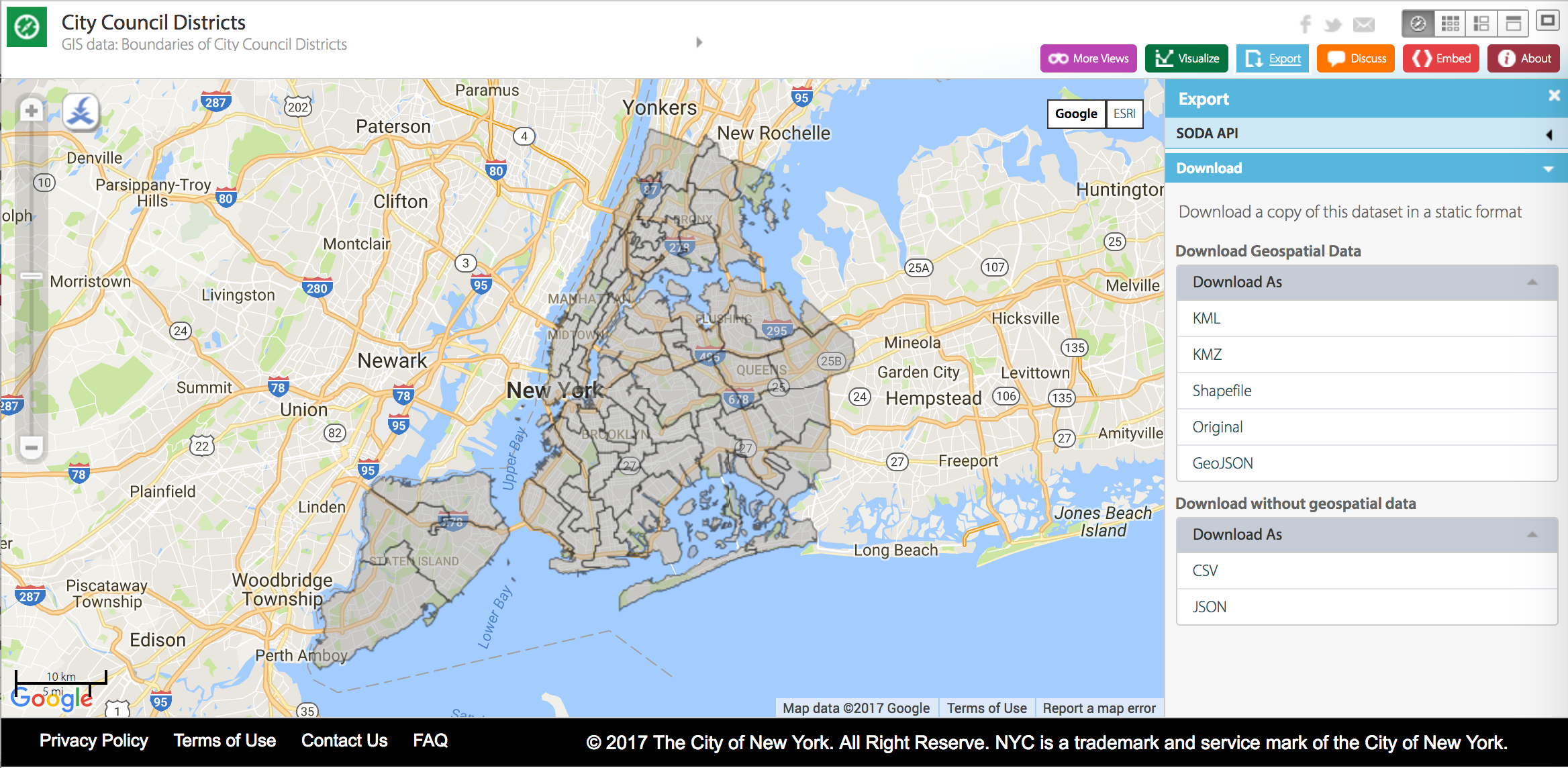
The About tab of individual datasets will have some description about it and many have additional “data dictionary,” “file layout,” or “metadata” documents under Attachments that will provide more detail about each field.

City Council districts
Community districts
NYC Parks
Building footprints
NYCHA developments
Subway lines
Subway stations
The 100 year floodplain for the 2020s
MapPLUTO
MapPLUTO is a large dataset available via the NYC Department of City Planning that has comprehensive citywide property information. For example, it contains fields that tell you who the owner of a property is, the building square footage, the number of units (e.g. residential apartments), and the zoning designation. For descriptions of the fields contained in the MapPLUTO dataset, see DCP’s PLUTO Data Dictionary. On DCP’s PLUTO page you can download “shapefiles” (spatial datasets) for each borough that can be brought into Carto. These files can be quite large. To make it more manageable, Chris Whong has developed the NYC PLUTO Data Downloader that allows you to filter geographies and fields before downloading PLUTO data as GeoJSON.
Carto’s Data Library
Carto has a built in Data Library that you can access on your Datasets page. The Data Library contains multiple NYC and U.S. datasets.
Adding public assets with NYCommons data
You can also download data from NYCommons to add to your map. Use the Filter option to select property types and ownership. After filtering, click Details to download the filtered data in GeoJSON format. You can then add this to Carto.
- Make your map!
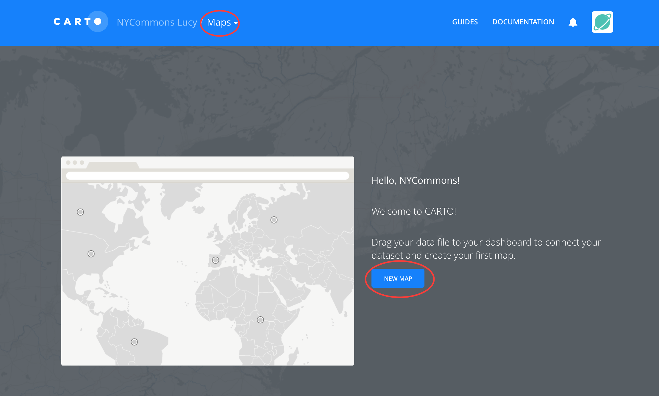
Once you have datasets imported to your Carto account, you can easily add them to a map by creating a New Map from your dashboard (if you don’t see the link, make sure it says Maps at the top of the page next to your username instead of Datasets). Then, select the datasets you’d like to add.
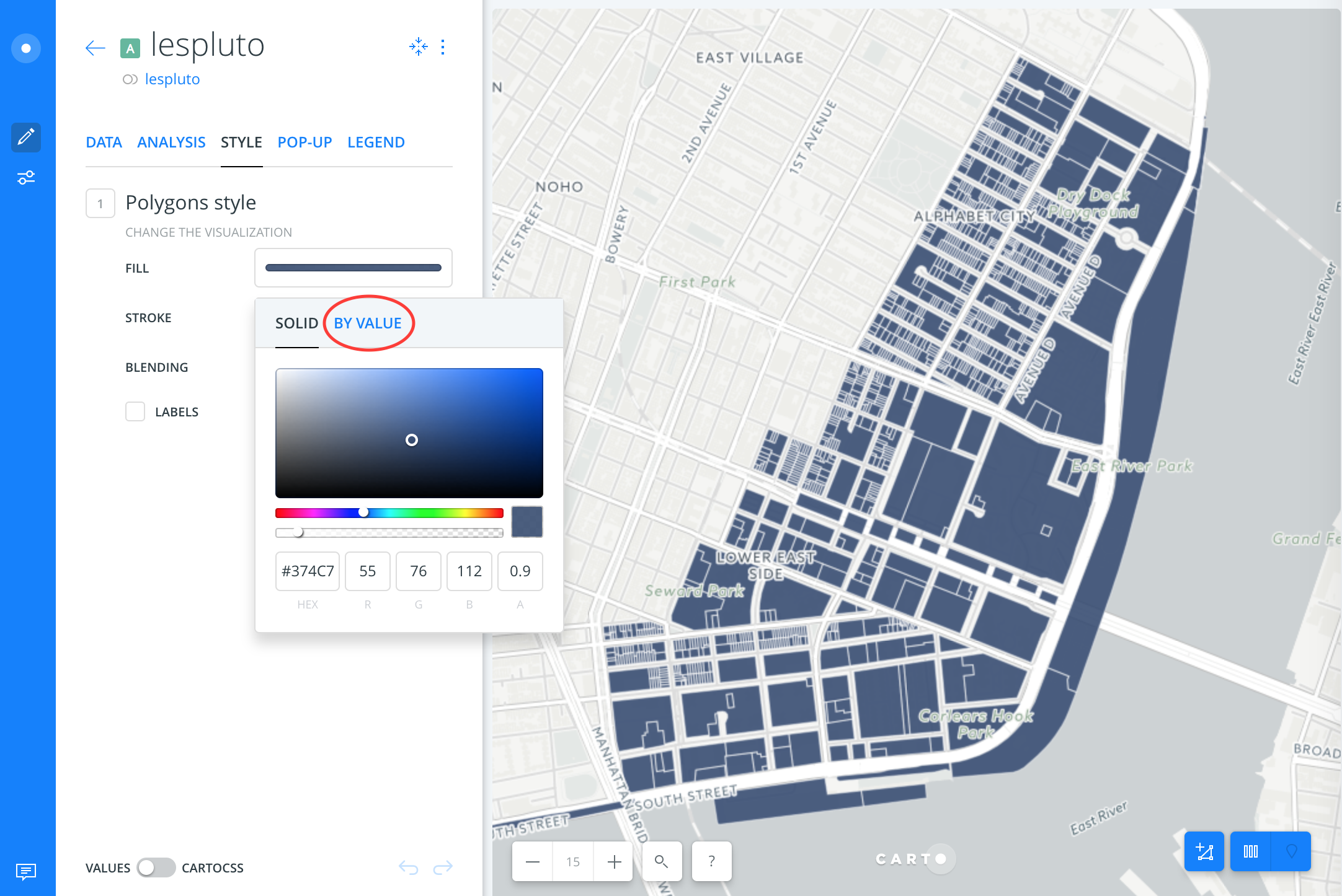
Select a layer of your map and click the Style tab to change the way the data displays.
Style: Style settings let you change the color and outline of your shapes. Map layers are constituted of polygons, lines, or points. For point data (such as NYCommons lots) you can also adjust the size of the circle/shape for that point (the number in the Fill option represents size).
Style by value: This allows you to stylize and visualize individual shapes within a layer according to the values of the underlying data. You can do this based on categories–e.g. with NYCommons lots, you could click the Fill color, select By Value, and select the known_use column. This will give parks, waterfront properties, community gardens, etc. different colors. You could also do this by owner_type or owner.
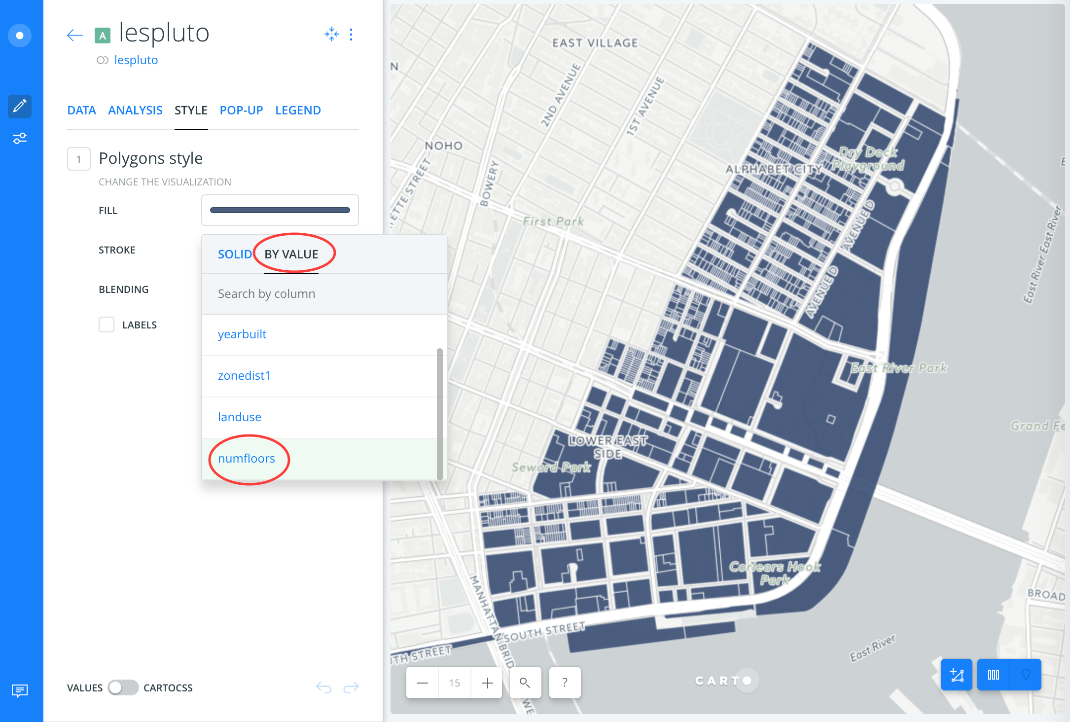
If the values of the data you’d like to display are numerical, you can visualize them with color gradients (polygons and points) or size the shapes proportionally to their value (points). Carto will give you this option if you select a numerical category to style by value.
E.g. PLUTO data has a field for the number of floors (numfloors). If you style by that value, Carto will display taller buildings as darker colors.
See Carto’s guide on styling by value for more details.
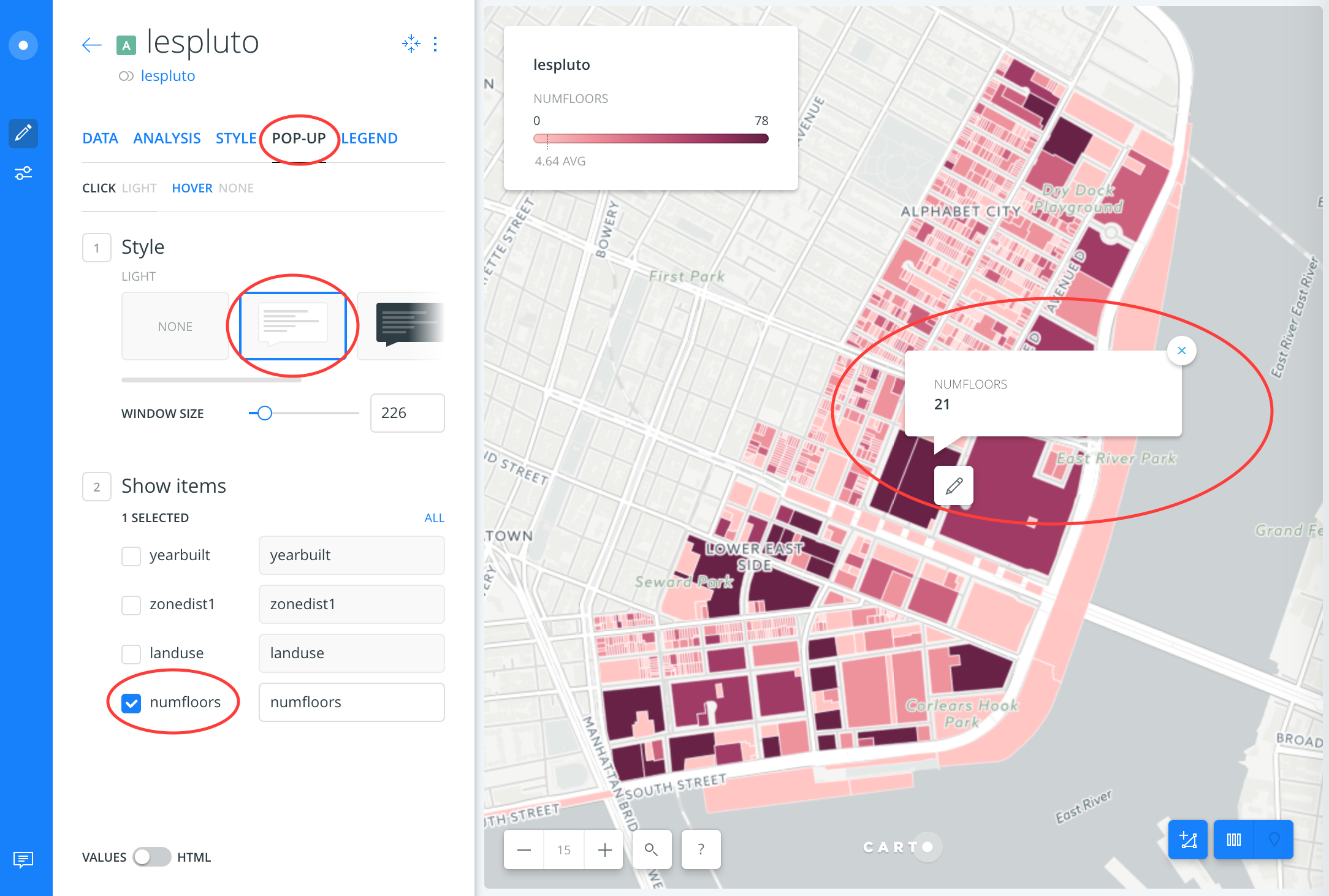
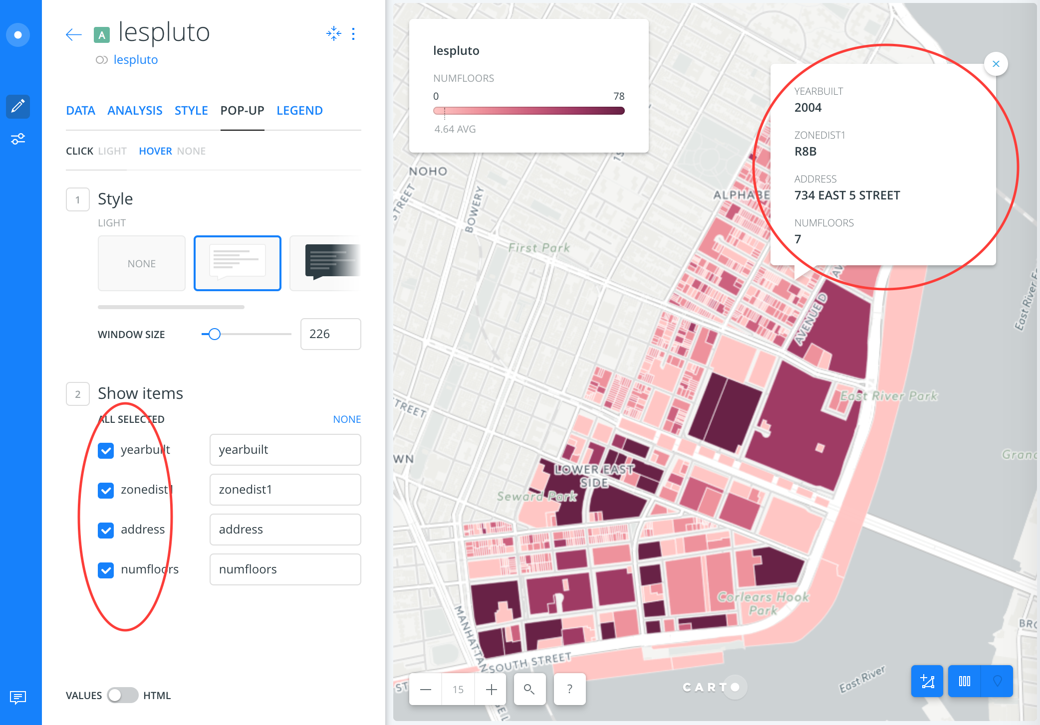
To make your map interactive, you can select fields to display in pop-up windows for a layer (in the Pop-up tab). You can specify fields to display when you hover your mouse over a shape or when you click on it.
You can find other Carto guides on their website that explain features like exploring your data with widgets, manipulating data, and analyzing it.
Tutorial: Visualizing PLUTO data
Here is a map you could make if you were interested in seeing approximately how tall buildings in your neighborhood are, what their zoning district is, and when they were built. This could give you some important context if a rezoning was being proposed in your neighborhood. You can find general information about zoning and individual districts on DCP’s website.
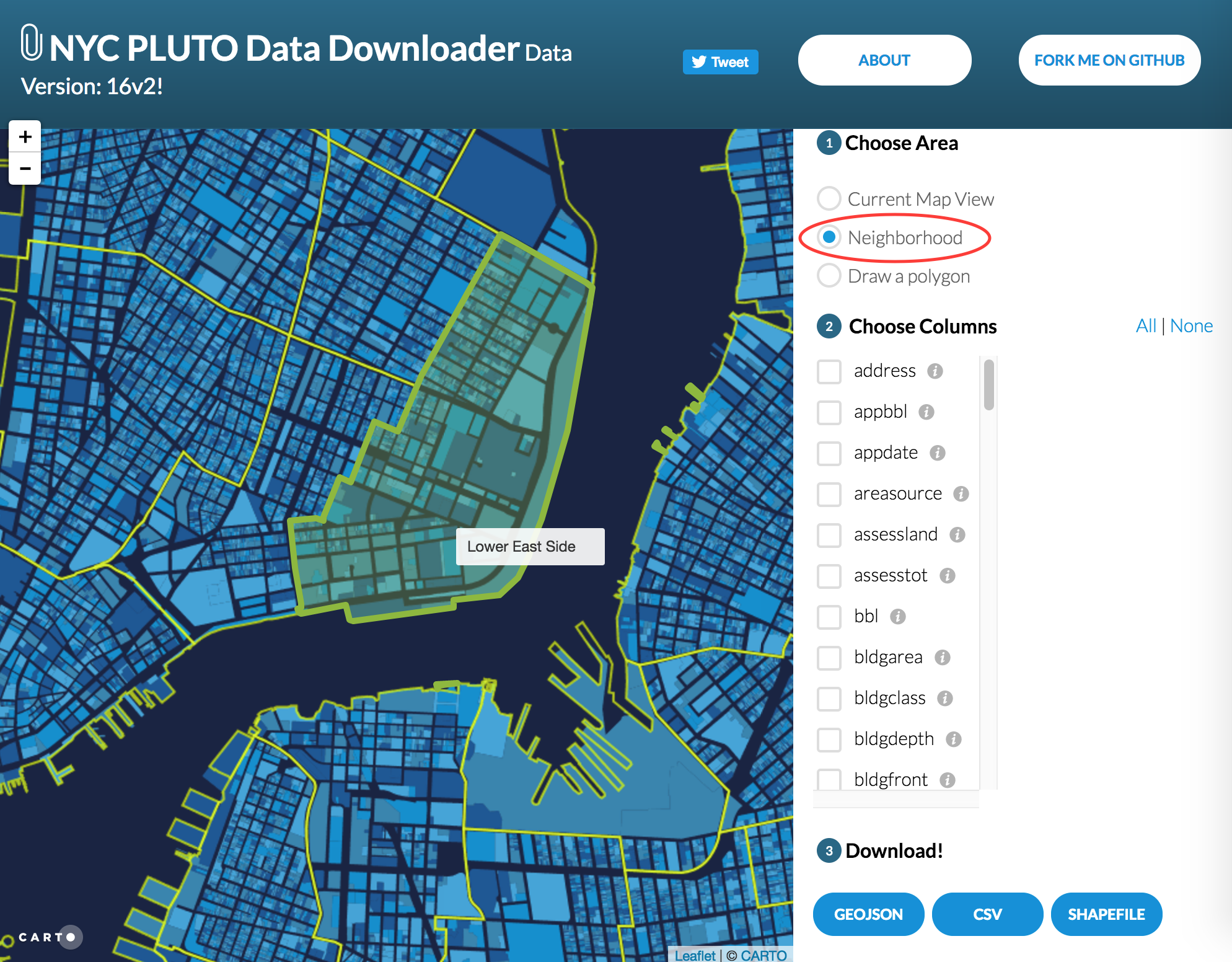
1. Use the NYC PLUTO Data Downloader to select and download a dataset.
2. Select Neighborhood and then click the Lower East Side, or select a different geography you’re interested in. Select the columns address, numfloors, yearbuilt, and zonedist1. Download as GeoJSON.
3. Drag the downloaded file onto your Datasets screen and click Connect Dataset.
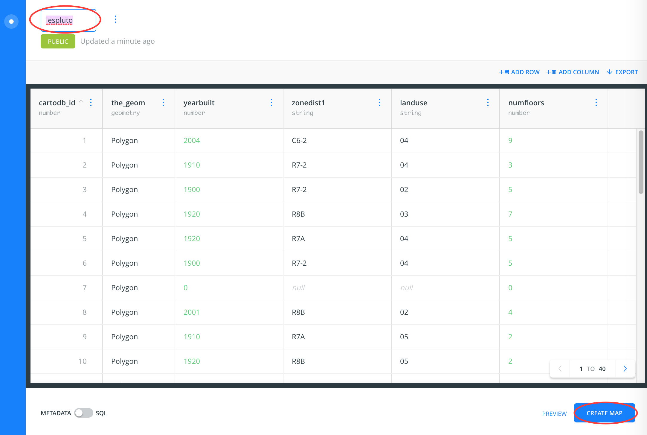
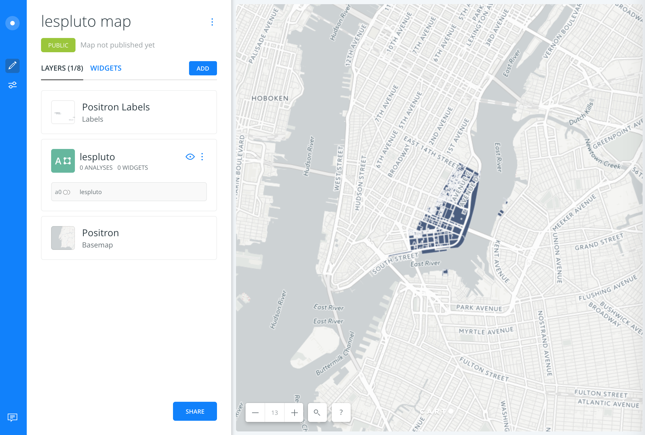
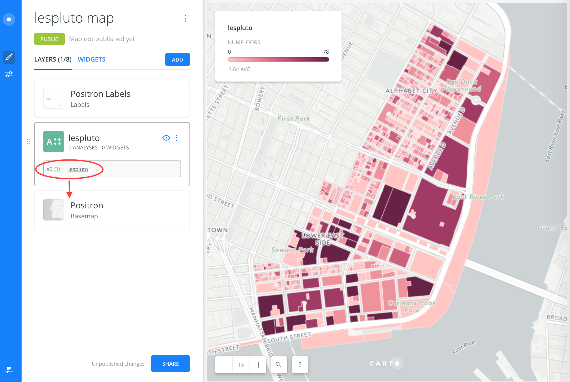
4. Click Create Map to start. If you’d like to rename the dataset you can do it here (doing it later could break your map), e.g. lespluto.
5. On the map screen you can click Take a Tour to help get oriented your first time doing this. Then, Edit Your Map.
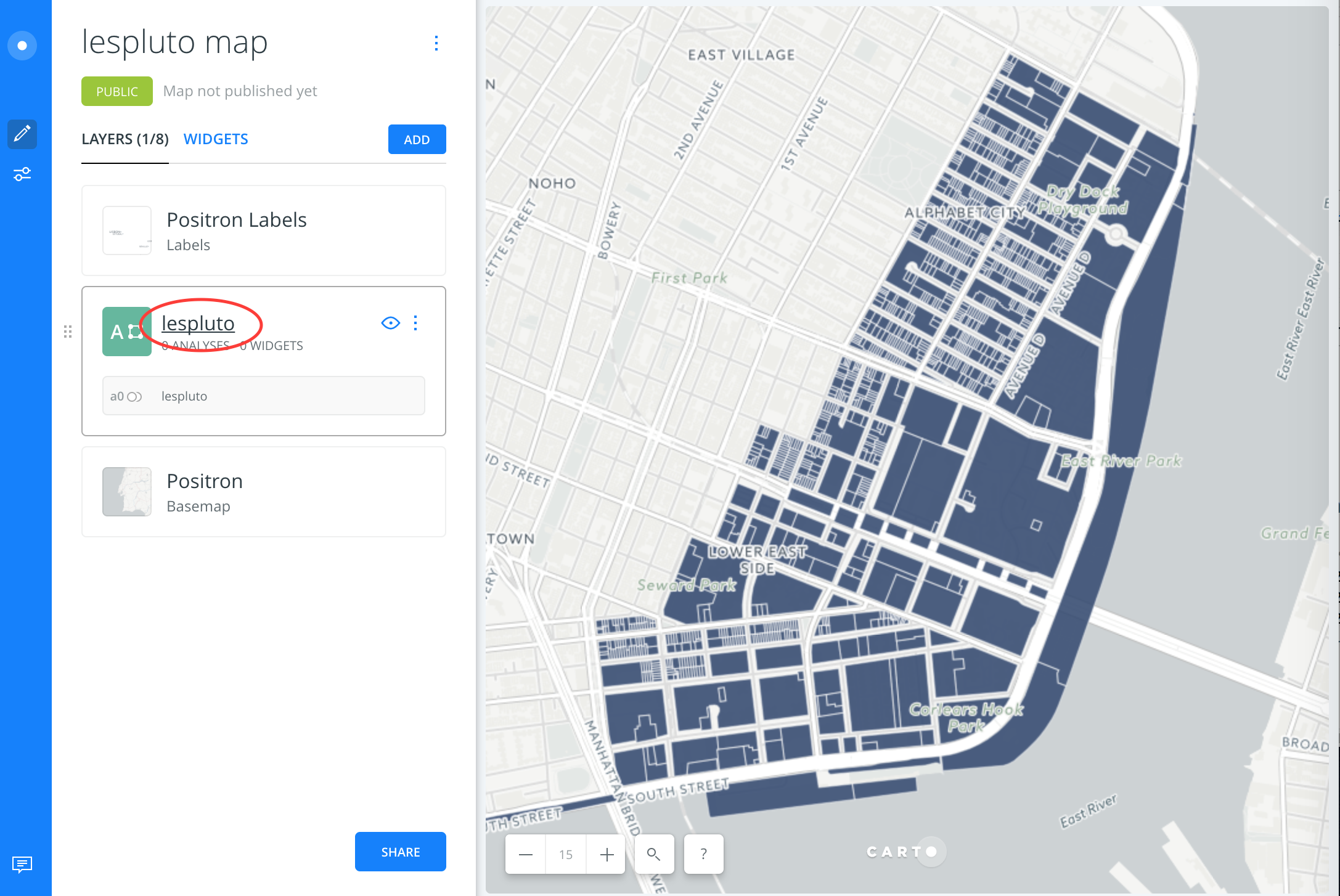
6. Zoom in on the new Lower East Side PLUTO layer. One quick way to zoom is to hold down the Shift key and draw a rectangle around the area you’d like to zoom in on.
Visualize building heights
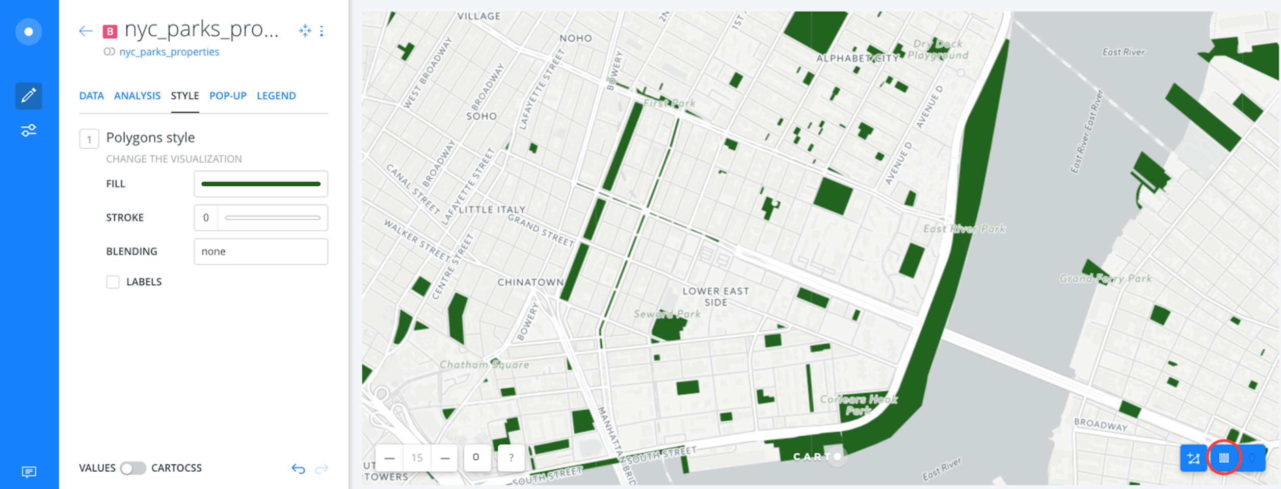
7. Click on the layer name to style it.
8. Click through the popup screen to take you to the Style tab, then click the colored bar next to the word Fill. From here you can change the color of the shapes in the layer, but it will be uniform and won’t tell you much about your data (except for the shape of tax lots).
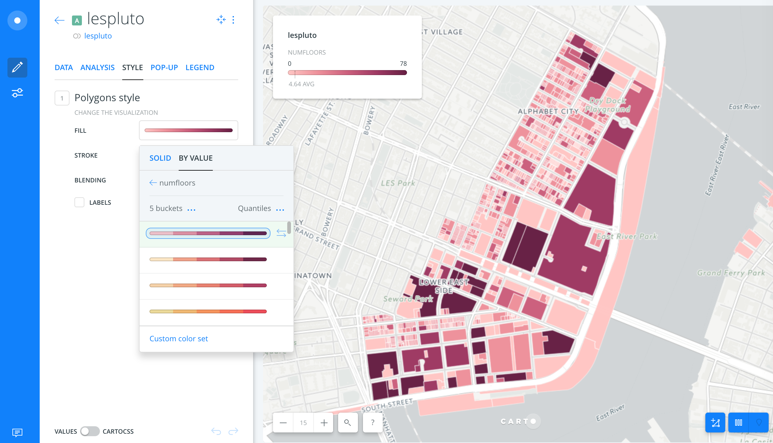
9. Click By Value. Select numfloors. Numfloors is the number of floors of the tallest building on each individual property.
10. By default, the map will break the dataset into five categories, or “buckets,” with the darkest colors representing the tallest buildings in the neighborhood.
11. Next click on the Pop-up tab. Select a white box and check off numfloors. Now, if you click on a property, a pop up will display its number of floors. You can now explore approximate building heights in the neighborhood; the average floor height in a building, especially a residential one, is usually a little more than 10 feet.
Tip: you could visualize the age of these buildings by following these same steps with the variable yearbuilt. Using this kind of gradient works because these fields are continuous numerical values.
Add in zoning districts
12. Click the left arrow next to the layer name on the top left to return to the main map screen. Then click the box displayed underneath the layer name that says a0 and drag it downwards. This will duplicate the layer.
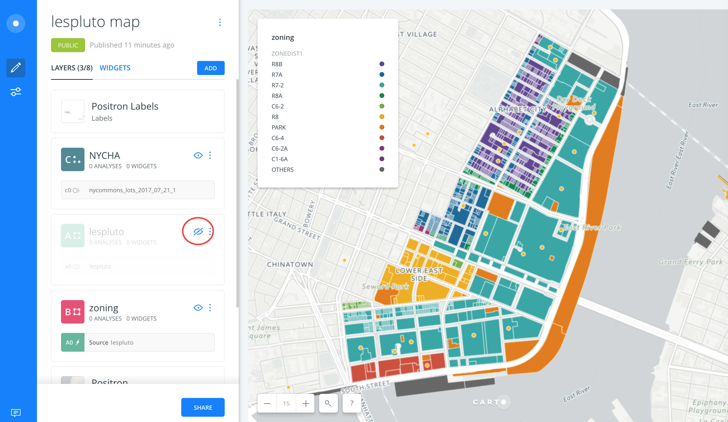
13. Double click the name of the new layer, which is the same as the first one, and rename it zoning.
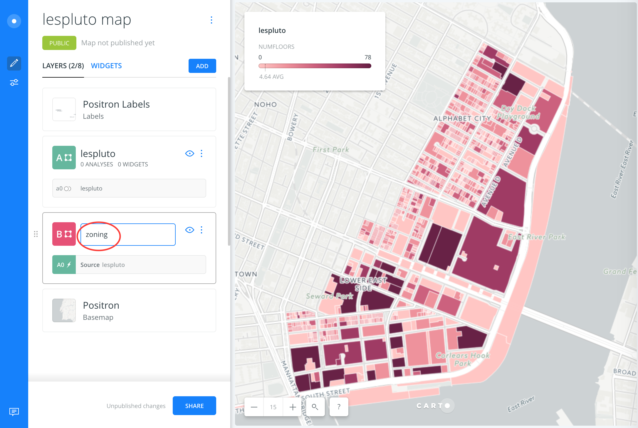
14. Navigate to the Style tab, select By Value and select zonedist1 instead of numfloors. Then, click the left arrow next to the layer name zoning to return to the main map screen.
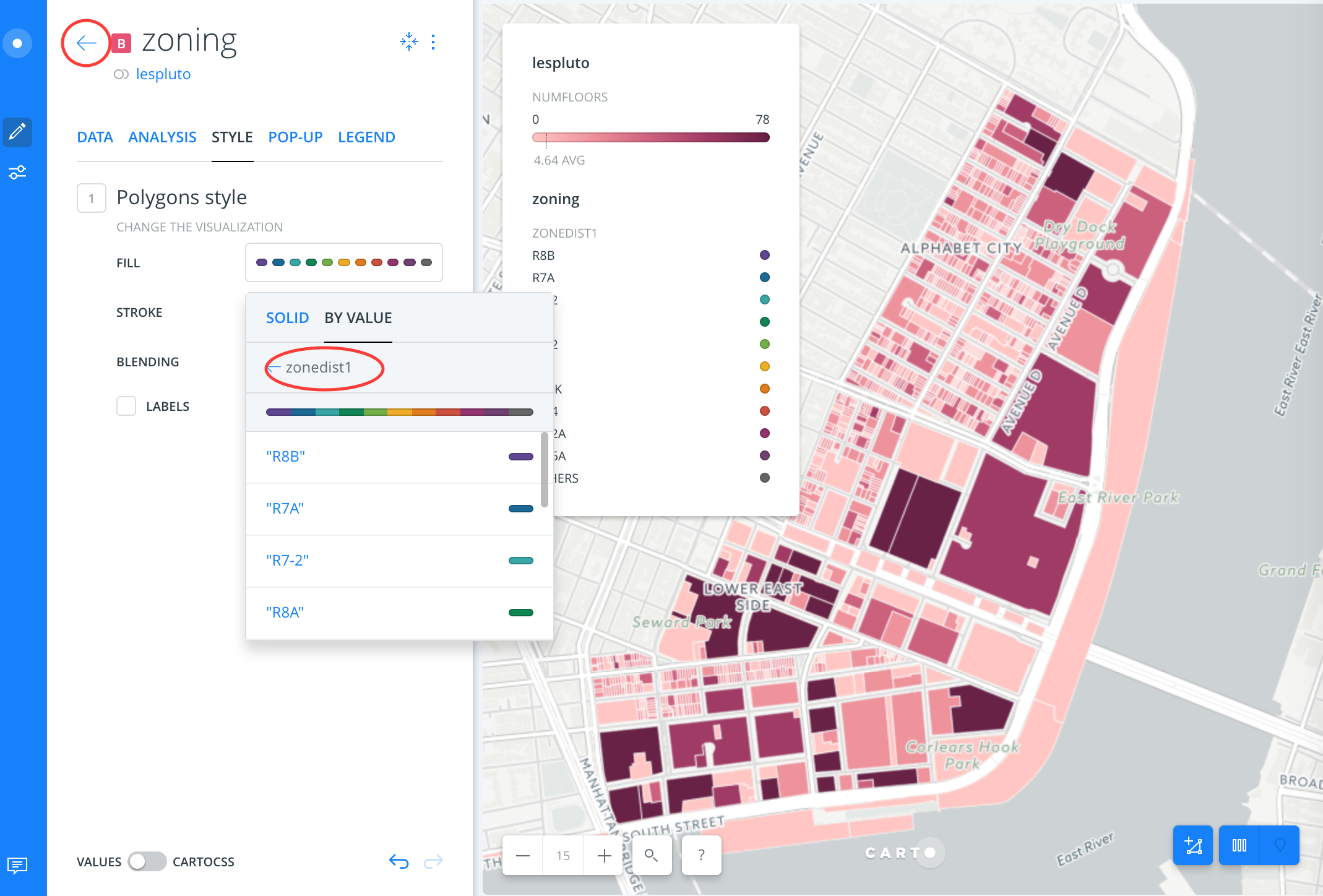
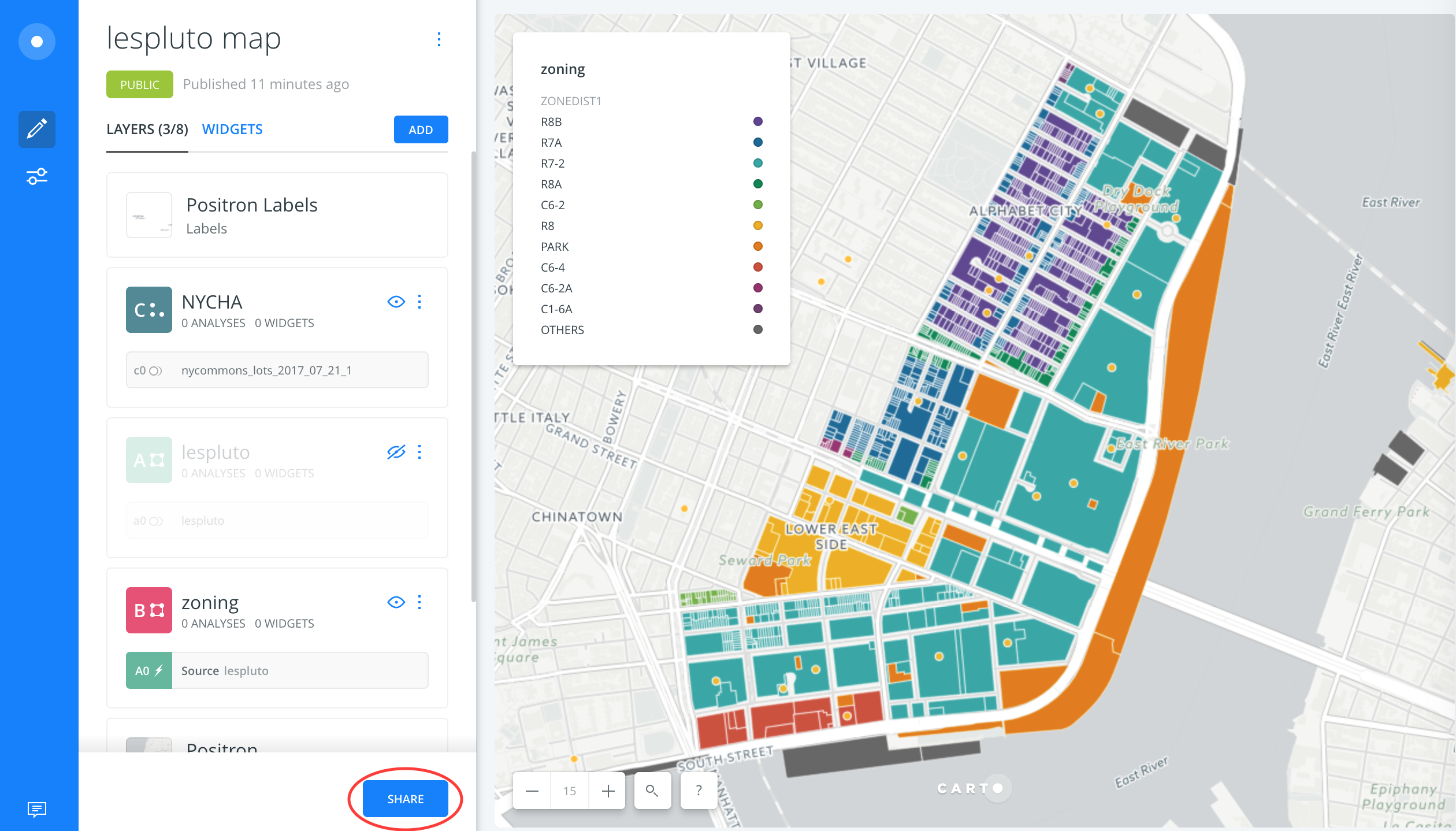
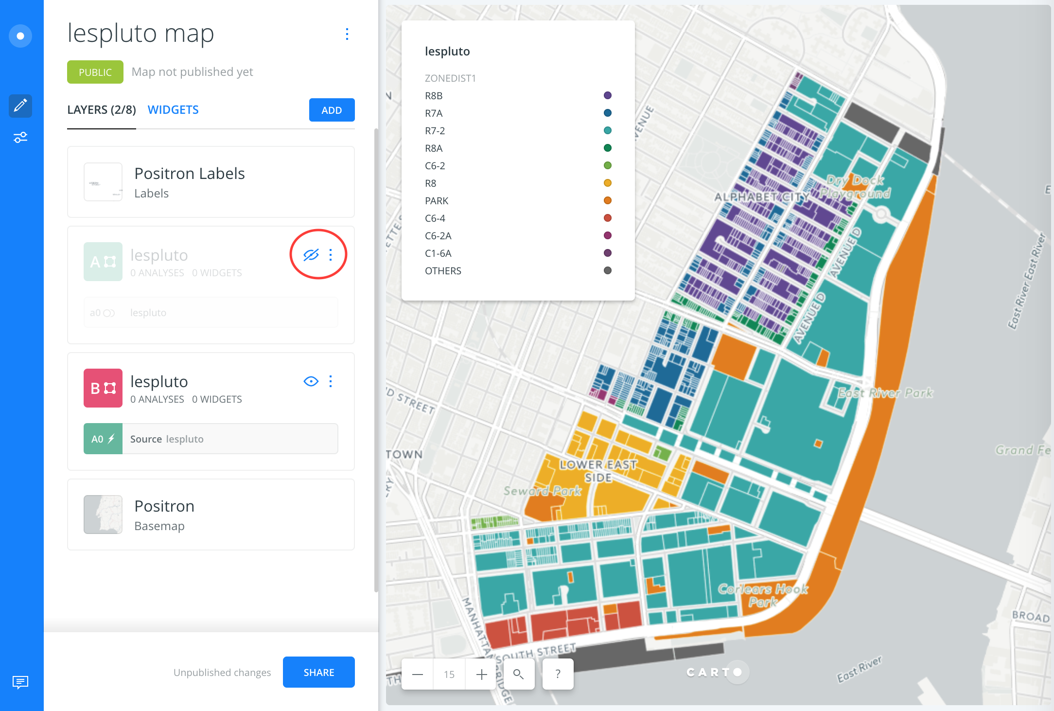
15. Click the eye icon next to the top layer to turn off the style for number of floors. You can now see the different zoning districts in the neighborhood. These are grouped into categories instead of buckets because zoning district is a non-numerical value. Turn the first layer back on and turn zoning off.
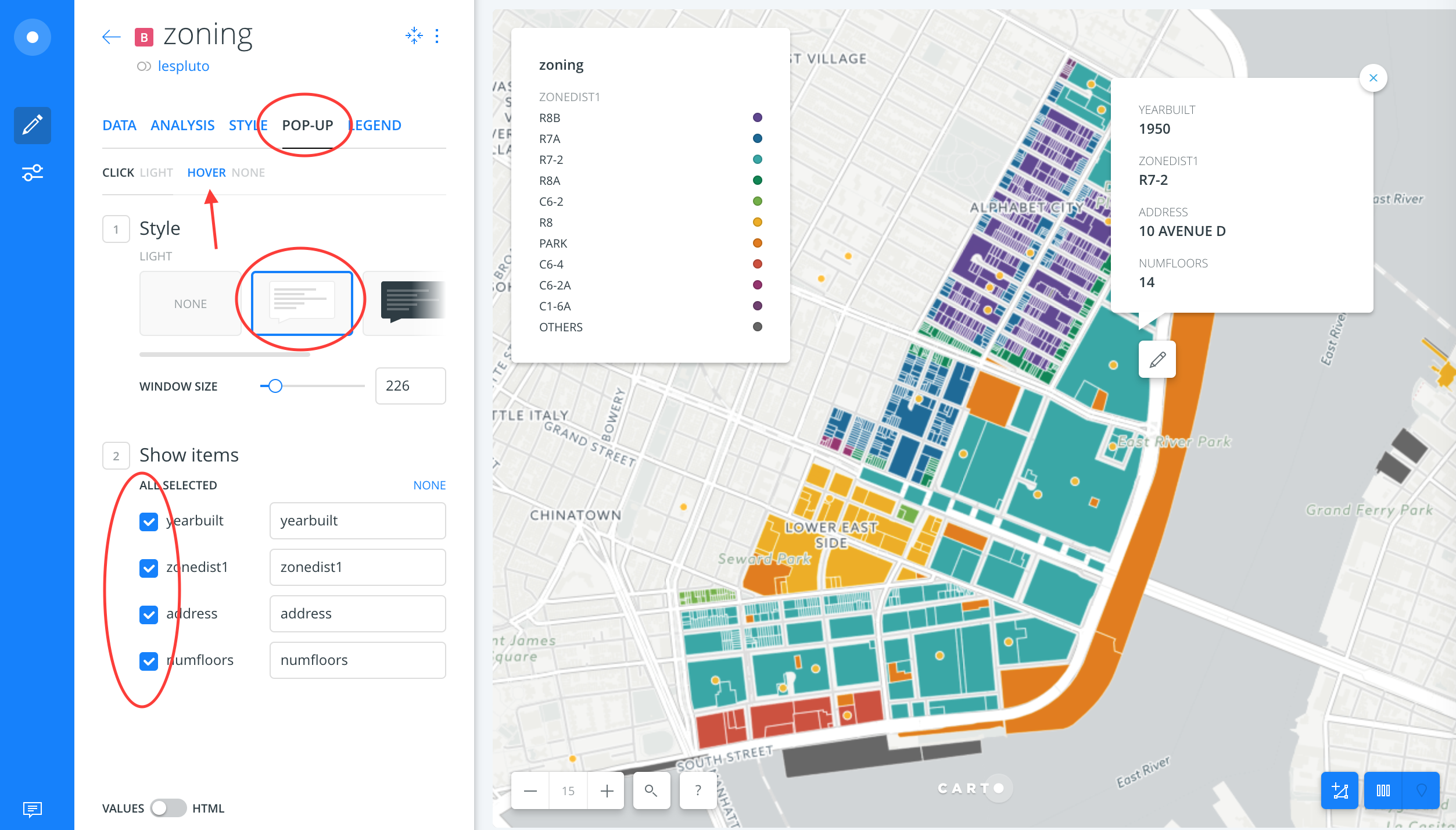
16. Return to the Pop-up tab of the first layer. Check off yearbuilt, zonedist1 and address as well as numfloors. Now, when you click on a property, you can see all the information. Note: You can also choose Hover on the pop-up screen to show data when you hover over each shape, as opposed to click on it.
If you’re interested in what size building an R8B district allows, for example, you can find it on DCP’s website. The build year is important because zoning changes over time and buildings are only subject to the zoning designation at the time of their construction. You can figure out if the area has ever been rezoned by finding the zoning map number and then viewing its corresponding historical zoning maps. Maps of the East Village show that the area was mostly R7-2 until 2008. 734 E. 5th St was built before then, so it was subject to R7-2 regulations.
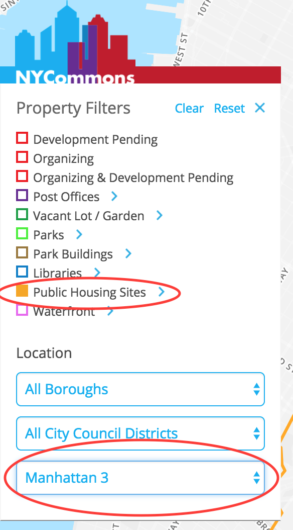
17. Download NYCHA data from the NYCommons website by filtering for just
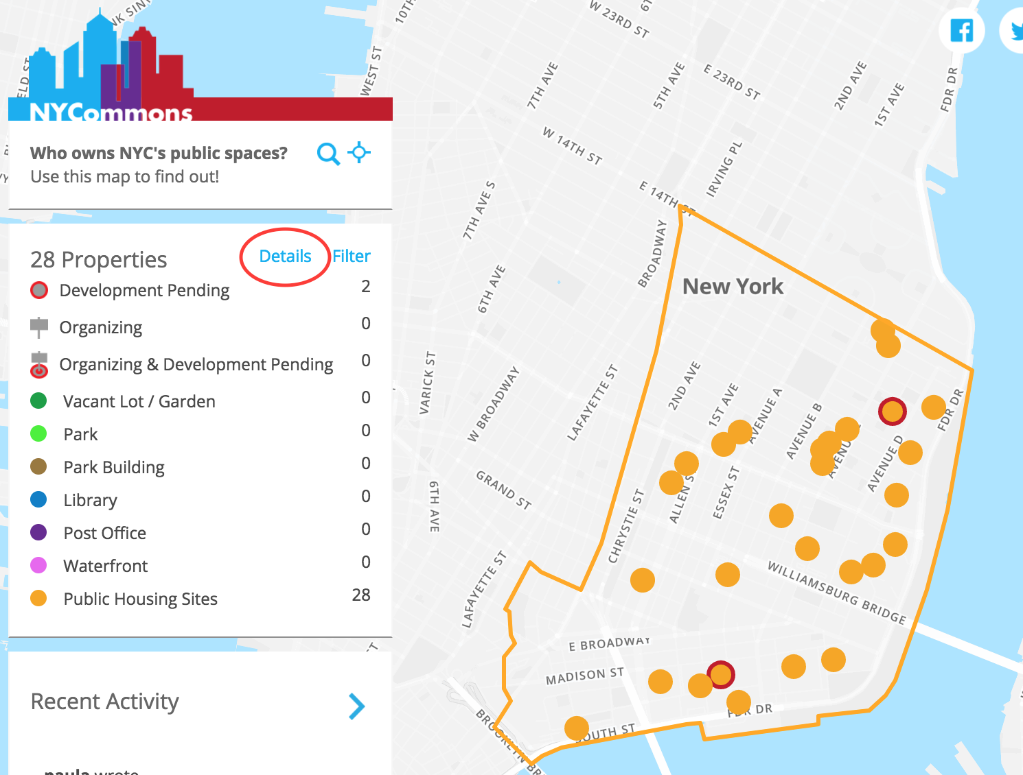
Public Housing Sites (click Filter). Select Manhattan Community Board 3 under Location. Close the filter window, select Details, and download as a GeoJSON.
18. Upload the GeoJSON file to your Carto account. You can do that directly from the map by clicking the Add button and then Connect Dataset and dropping the file into the window or navigating to it.
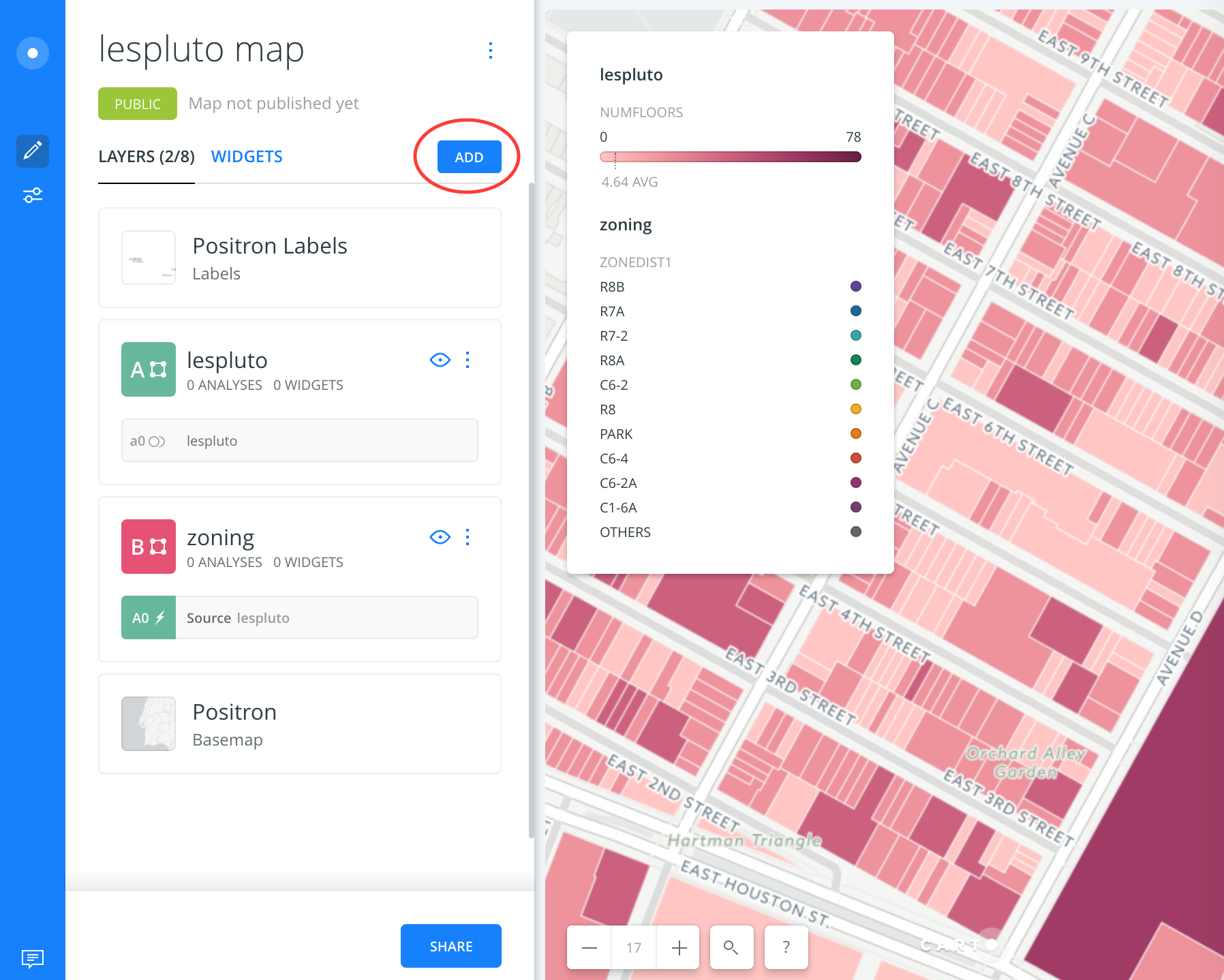
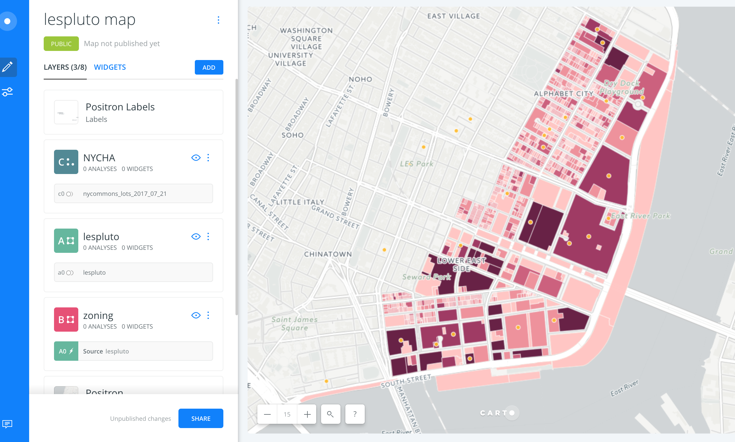
19. Rename your new layer NYCHA. You can now view the locations of NYCHA properties on the Lower East Side. You can still click on the lots for their number of floors and zoning designation. The PLUTO data on zoning designation, number of floors, and build year can help you figure out if there might be unused air rights on the property. MAS’s Accidental Skyline map can tell you more information about any available FAR (floor area ratio). You can visualize the zoning districts again by clicking the eye on the lespluto layer.
20. You’ll have to enable Pop-ups for that layer the way you did with lespluto to be able to view information when you click. There is also a Hover option to view information when you hover over a shape rather than click on it.
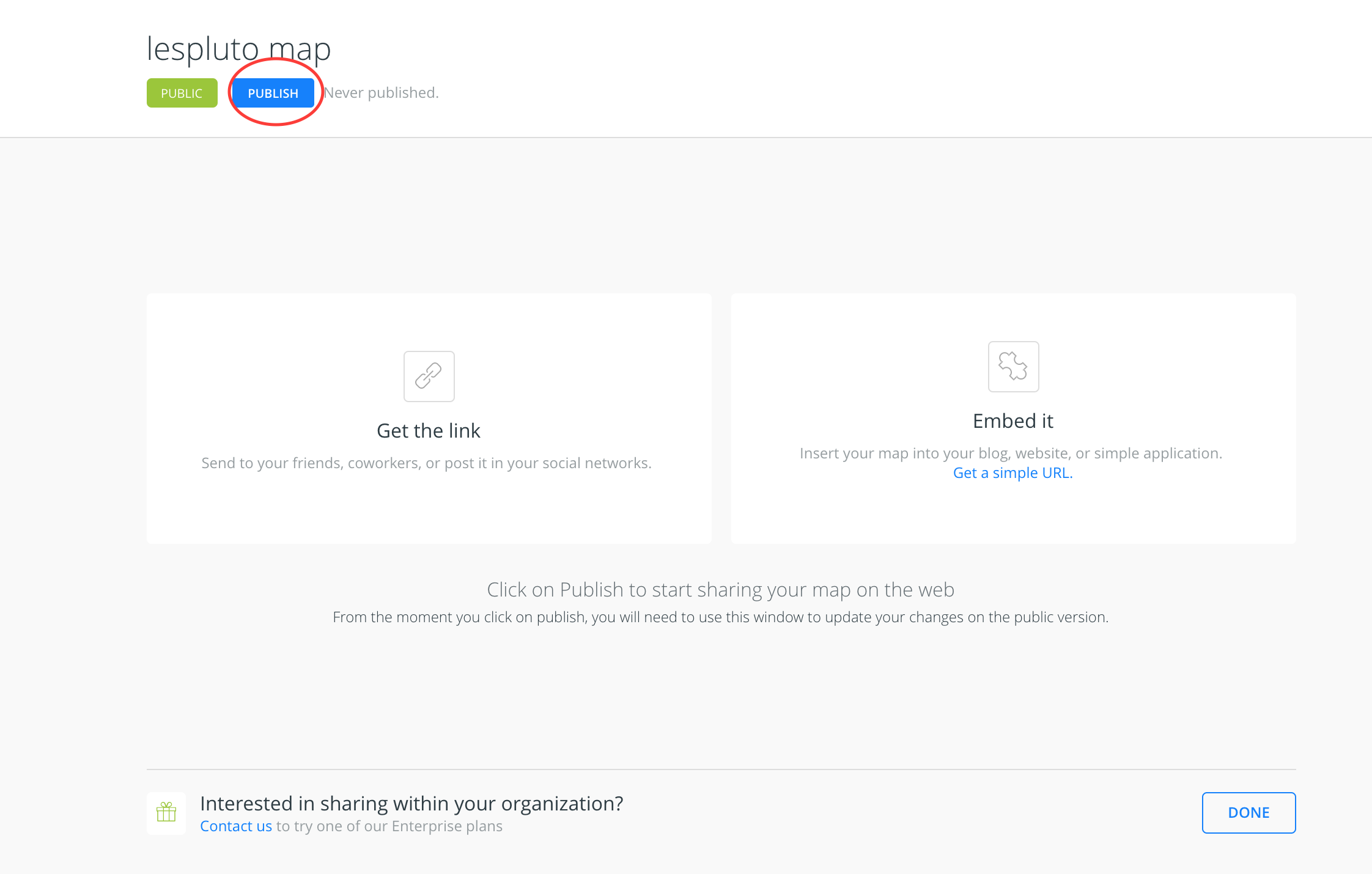
21. You can share your map by clicking Share on the main map tab. Then, click Publish. You’ll be able to copy a link to send others. If you want to update your live map at any point, you have to return to this screen and click Update where it first said Publish.